DriveWell Advance
Improving clarity and engagement in a usage-based insurance app to help users understand and act on their driving behavior
Role: Product Designer, collaborated across a team of designers on a full product redesign
Focus: Product redesign, information architecture, behavior change, UX clarity
Improved understanding of how driving behavior impacts score and savings
Increased engagement with core product features like trips and summaries
Simplified a previously cluttered and overwhelming experience
Problem
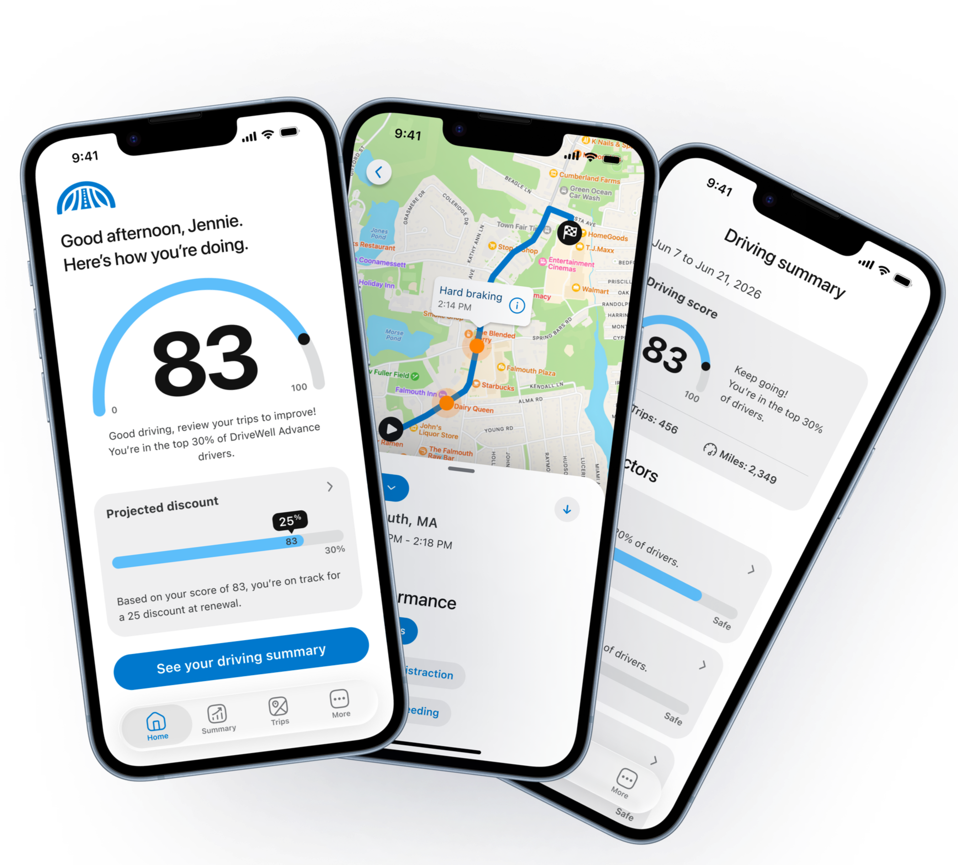
The previous experience, DriveWell Go, surfaced too much information at once, making it difficult to understand driving performance and key insightsDriveWell Advance was a ground-up redesign of the legacy DriveWell Go app, used by insurers to deliver usage-based insurance programs.
The existing DriveWell Go experience was cluttered and difficult to understand.
The home screen and core flows surfaced too much information at once, making it hard for users to quickly understand their driving performance.
At the same time, the relationship between driving behavior, score, and discount, which represents the core value of the product, was unclear.
Where it broke
The home screen and key flows were overloaded with UI and competing information
Trip details displayed all driving events at once, creating cognitive overload
Score and discount were not clearly connected within the experience
Navigation made it difficult to find and understand key information
Why it mattered
Users struggled to understand how to improve their driving behavior and connect it to savings
Overwhelming experiences reduced engagement and trust
The UI felt outdated, lowering confidence in the product
Reduced engagement and poor perception impacted both retention and the ability to win new customer contracts
Approach
The problem wasn’t just UI. It was a lack of clarity in how the product communicated value.
I helped focus the redesign on simplifying the experience and making key information easier to understand.
We worked to:
reduce visual and cognitive clutter
restructure how information was organized and surfaced
make the relationship between driving behavior, score, and savings more clear
Key Decisions
To improve clarity and engagement, we focused on a set of key decisions that reshaped how the product communicated value.
Clarifying the score to savings relationship
The product’s core value, drive safely to earn savings, was not clearly communicated.
I helped shape the experience to better connect driving behavior, score, and discount within the same flow.
Result: Users could more easily understand how their actions impacted their outcomes.
Reducing cognitive overload in trip details
The previous experience displayed all driving events simultaneously, which overwhelmed users.
I contributed to simplifying how trip data was presented by prioritizing key insights and improving structure.
Result: Users could more quickly interpret their performance without being overloaded.
Shifting from punitive to more neutral feedback
The existing experience emphasized per-trip scoring, which could feel discouraging.
I supported moving toward a more balanced approach that focused on clarity and understanding rather than judgment.
Result: The experience felt more approachable and easier to engage with.
Improving information hierarchy and navigation
Important insights and actions were difficult to find within the app.
I worked to improve how information was organized and surfaced, making key features more discoverable.
Result: Users were more likely to explore their data and engage with core functionality.
What I built
From cluttered to clear
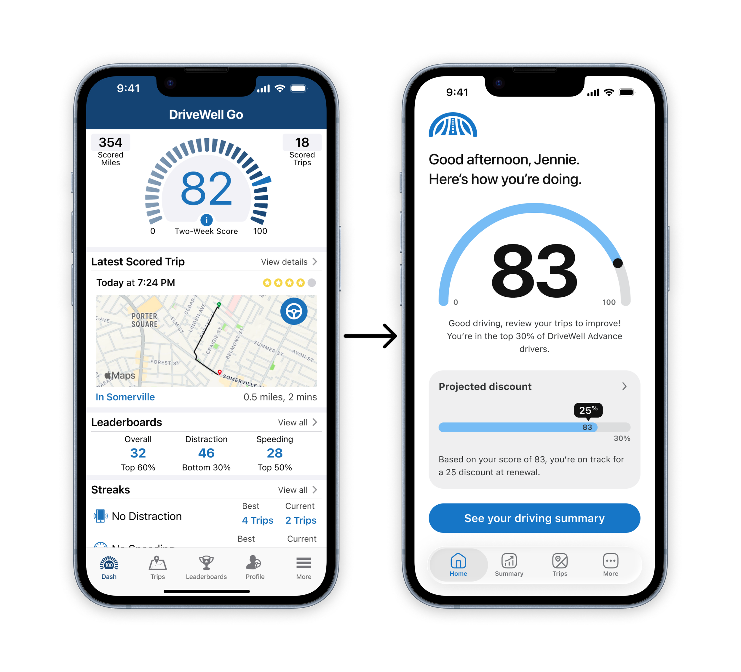
The redesign simplifies a cluttered experience into a clearer, more structured view that makes driving performance and savings easier to understand.Core experience improvements
Contributed to the redesign of the home, summary, and trip experiences, while leading the design of key features within the product
Improved information hierarchy and clarity of performance insights
Established clearer patterns for communicating driving behavior and feedback
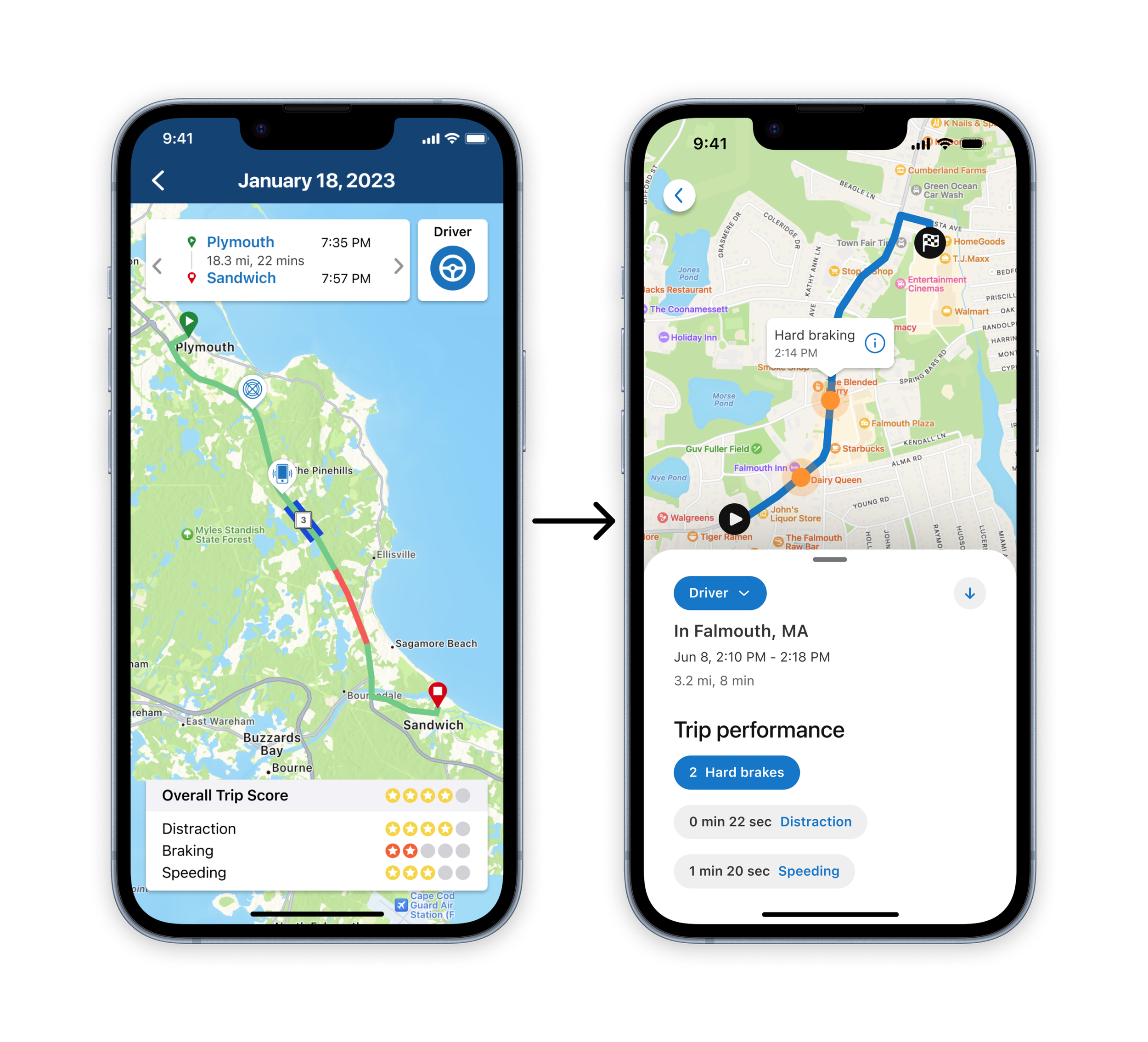
Trip details were simplified from a dense, all-at-once view into a clearer, structured experience that highlights key insights and makes performance easier to understand.Feature contributions
Led the design of key features that expanded the product experience and improved usability, safety, and engagement.
Family Sharing
App + Tag manual linking
CrashAssist
UX patterns and information architecture improvements across the app
Impact
Improved product clarity
Users better understood how their driving behavior impacts their score and savings.
Strong program adoption
One program achieved a 73% enroll-to-registration rate, the highest in their program history, indicating improved onboarding and early user understanding.
Increased engagement and retention opportunity
User behavior analysis identified up to a 6% retention lift when users engaged with trip details early in their experience.
Strengthened customer confidence and growth
Modernizing the product experience supported continued investment, including new partnerships and expanded program initiatives.